
This section is incomplete! You can help out by contributing documentation here !
Now that we have successfully fetched the data from the Mastodon servers, it's time to render it in a more presentable format. Instead of outputting the raw JSON data as we did in the previous chapter, we can attach a ShadowDOM to our element and insert the data into a template.
First, let's modify our TootEmbedElement class to use the attachShadow() method and insert the data into a template:
const template = document.createElement("template")
template.innerHTML = `
  <div part="header">
    <img part="avatar" src="">
    <h3 part="handle"></h3>
  </div>
  <div part="content">
  </div>
`

class TootEmbedElement extends HTMLElement {
  // ...
  static define(tagName = "toot-embed") {
    customElements.define(tagName, this)
  }
  // ...

  shadowRoot = this.attachShadow({ mode: "open" })

  connectedCallback() {
    this.shadowRoot.replaceChildren(template.content.cloneNode(true))
    this.load()
  }

  // ...
  get src() {
    const src = this.getAttribute("src")
    if (!src) return ""

    return new URL(src, window.location.origin).toString()
  }

  set src(value) {
    this.setAttribute("src", value)
  }
  // ...

  async load() {
    const response = await fetch(this.src)
    const { account, content } = await response.json()

    this.shadowRoot.querySelector("[part=avatar]").src = account.avatar
    this.shadowRoot.querySelector("[part=handle]").textContent = account.display_name
    this.shadowRoot.querySelector("[part=content]").innerHTML = content
  }
}

TootEmbedElement.define()
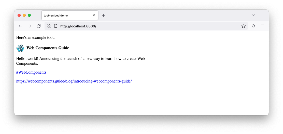
Now, when the element is connected to the DOM and the load() method is called, the data is inserted into the template and displayed in the element.
You should now see the Mastodon toot data displayed in a more structured and presentable format:
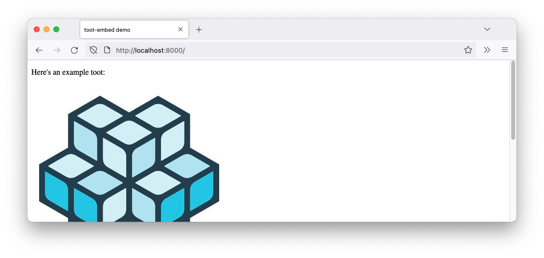
It's still not very good to look at! The image is way to big and the whole layout is a bit off. Let's add some
rudimentary styles to the component in a <style> tag to make it a bit better.
const styles = new CSSStyleSheet()
styles.replaceSync(`
  [part="header"] {
    display: flex;
    align-items: center;
    margin-block-end: 1rem;
  }

  [part="avatar"] {
    inline-size: 2rem;
    border-radius: 100%;
    margin-inline-end: 0.5rem;
  }

  [part="handle"] {
    margin: 0;
    font-size: 1rem;
  }

  [part="content"] {
    max-inline-size: 70ch;
  }
`)

const template = document.createElement("template")
template.innerHTML = `
  <div part="header">
    <img part="avatar" src="">
    <h3 part="handle"></h3>
  </div>
  <div part="content">
  </div>
`

class TootEmbedElement extends HTMLElement {
  // ...
  static define(tagName = "toot-embed") {
    customElements.define(tagName, this)
  }
  // ...

  shadowRoot = this.attachShadow({ mode: "open" })

  // ...
  connectedCallback() {
    this.shadowRoot.adoptedStyleSheets = [styles]
    this.shadowRoot.replaceChildren(template.content.cloneNode(true))
    this.load()
  }

  get src() {
    const src = this.getAttribute("src")
    if (!src) return ""

    return new URL(src, window.location.origin).toString()
  }

  set src(value) {
    this.setAttribute("src", value)
  }
  // ...

  async load() {
    const response = await fetch(this.src)
    const { account, content } = await response.json()

    this.shadowRoot.querySelector("[part=avatar]").src = account.avatar
    this.shadowRoot.querySelector("[part=handle]").textContent = account.display_name
    this.shadowRoot.querySelector("[part=content]").innerHTML = content
  }
}

TootEmbedElement.define()
In the next chapter, we will add styling to the component to make it look even better.